Refactor-U
brand update & UX & Web Design
RefactorU came to Emerson Stone to redesign its website which can define its brand image to enhance brand recall, reach more students, and increase its conversion rate.
Role: Project Lead
The Task
- Enhance brand image
- redesign the website's information and content structure to communicate with the brand's target audience better
- redesign its site user flow and increase conversion rate.
The Brand
RefactorU is a coding boot camp, and its main campus is located in Boulder Colorado. The brand was expanding its curriculum to data science, UX design, as well as its online classroom.
As a brand with an educational purpose that wants to help people improve and/or change their careers and wants to provide opportunities for the general population, RefactorU should be seen as a brand with a brand personality of authority, trustworthiness, and fairness.
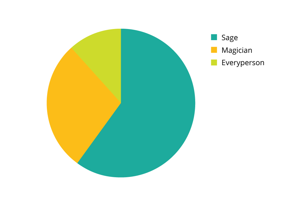
We defined its brand archetype as Sage, Magician, and Everyperson.
The Primary Target:
- People who are looking for a career boost or career change,
- who have a basic understanding of coding, and looking for guidance to reach the next level.
- The previous students who chose RefactorU also thought the campus location in Boulder was a plus. This indicates the students value a healthy lifestyle, quality of life, and network.
Tonality: Our visual and color inspiration was the New York subway system, which is a metaphor for "going places," and the trustworthy New York Times' editorial illustration style.
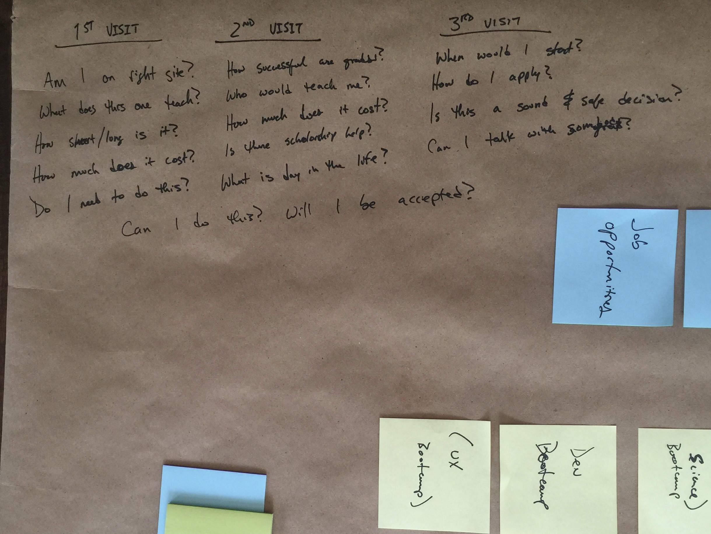
Visitors' Scenarios - Data-based Approach
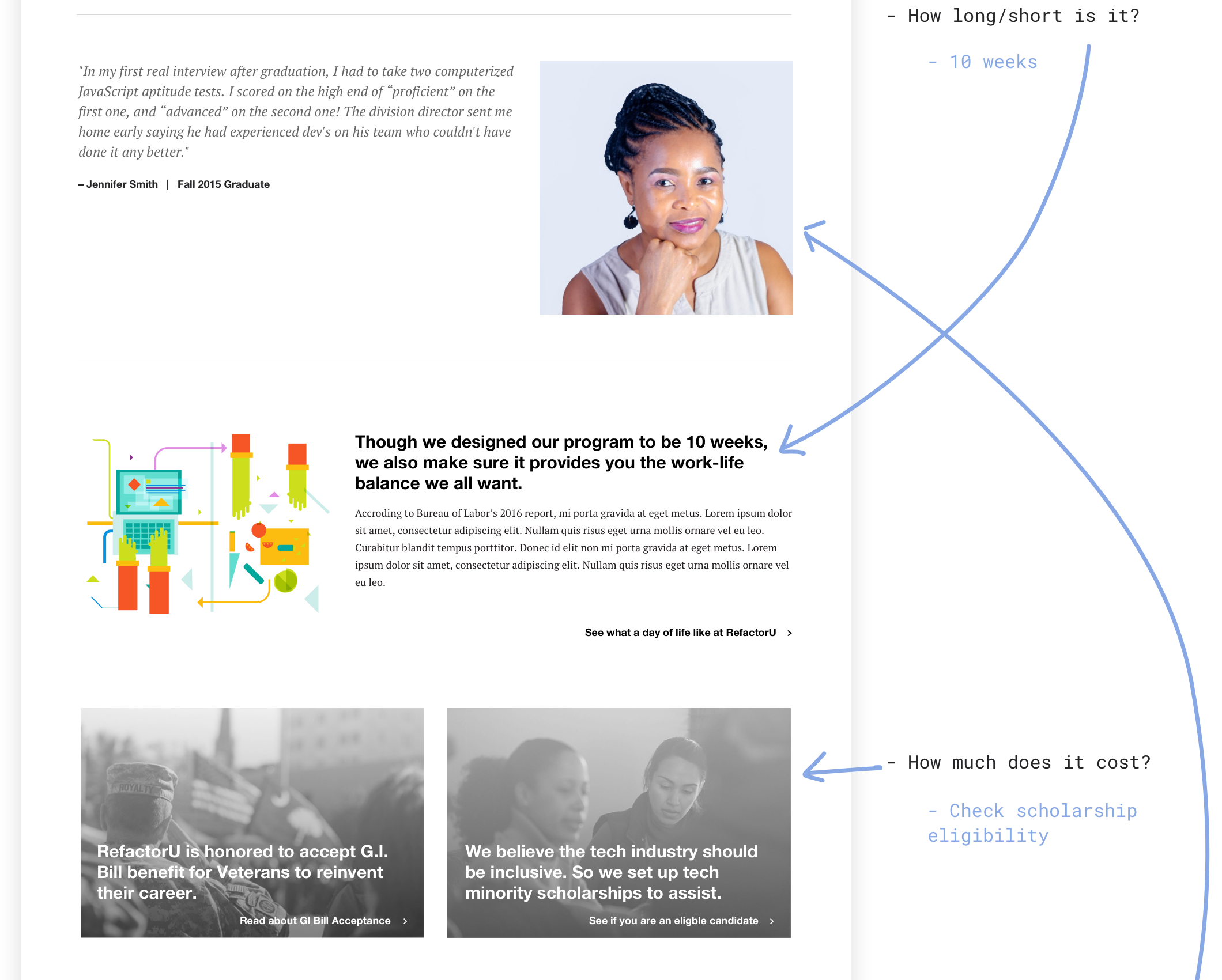
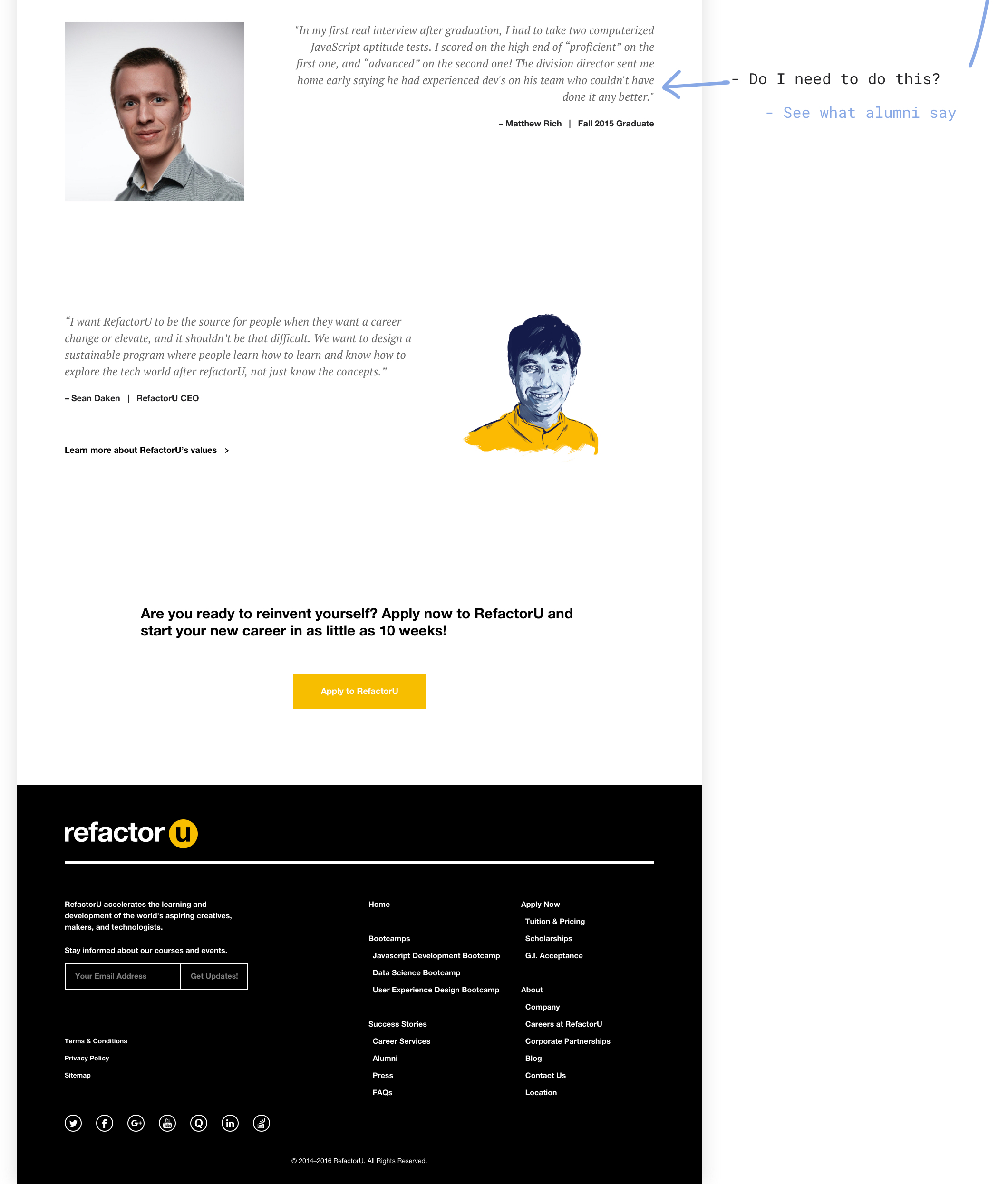
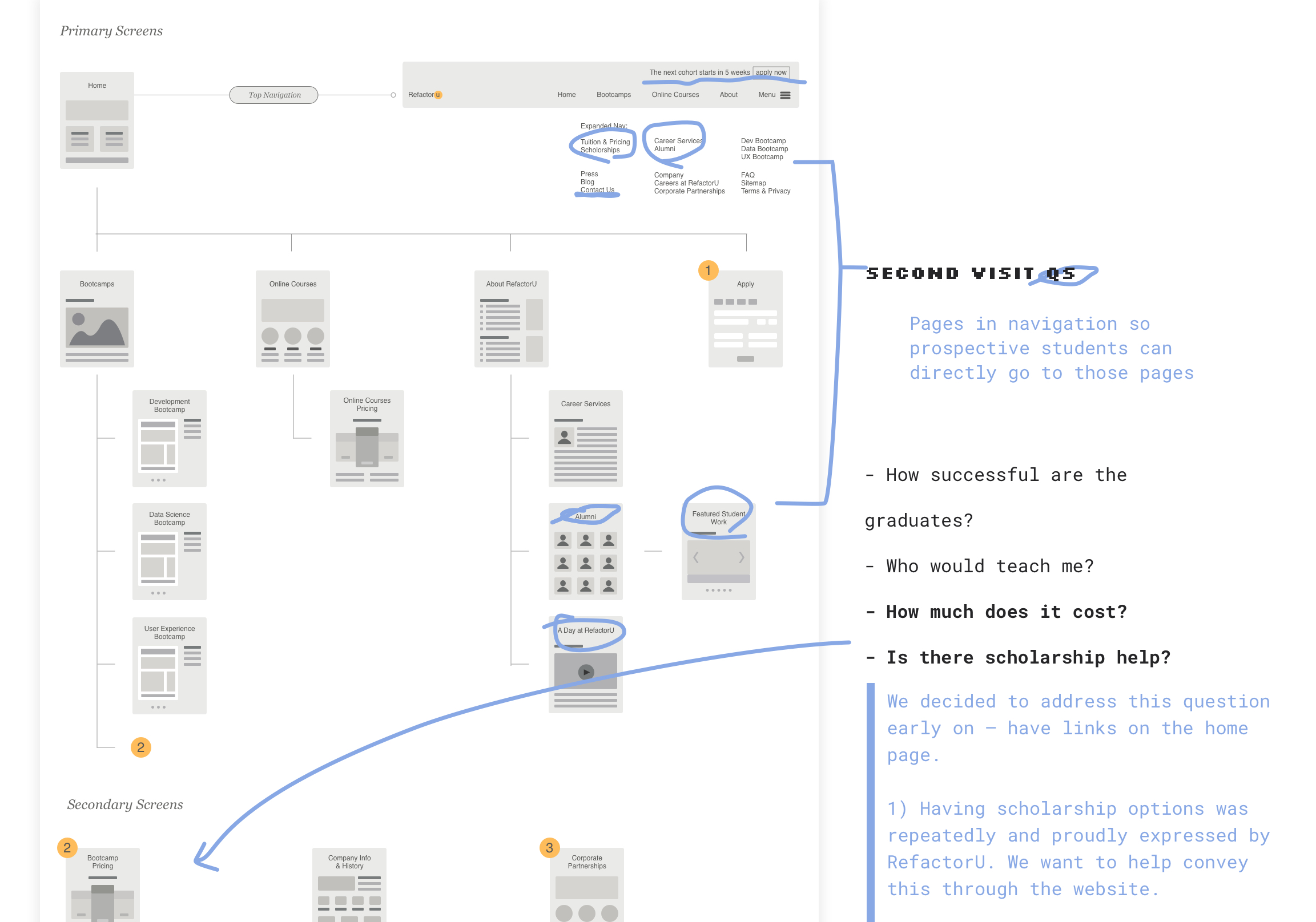
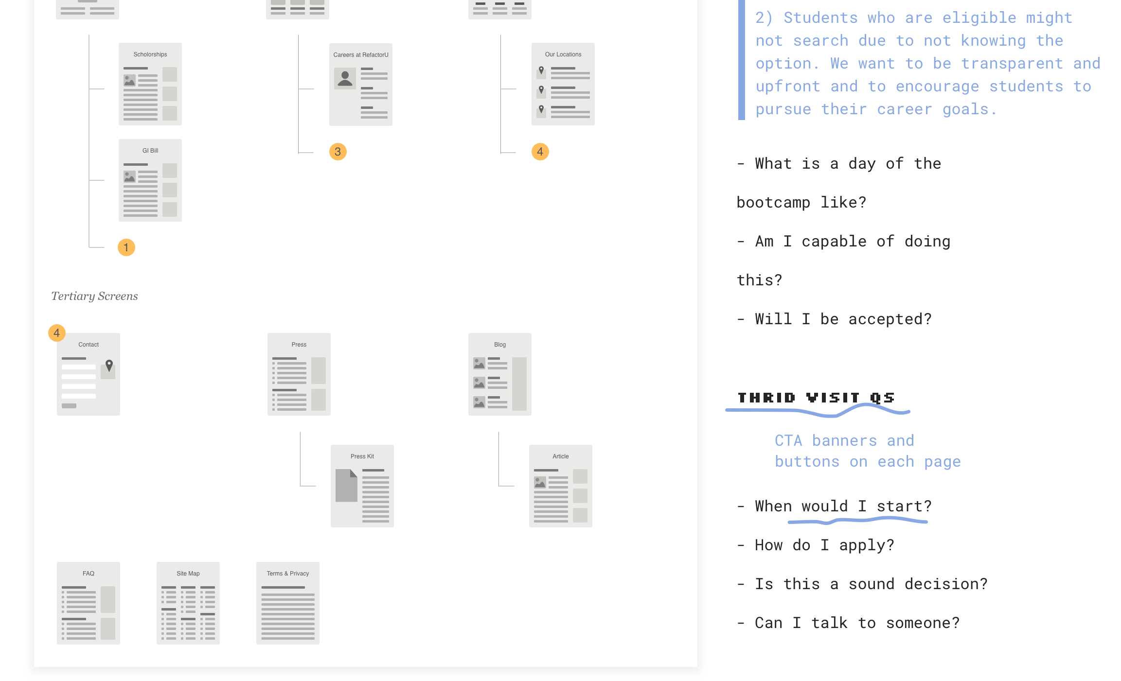
From RefactorU's previous site data, we realized the students who eventually reached out to the school and/or registered for a cohort have mostly visited the site three or more times (looking for answers to different questions they have each time, see below). We also see they seek certain information for each visit.
We want to help visitors make fewer visits to reach their decision, and to help prospective students get the information they need (see the questions they asked below) with fewer clicks.
We first listed out the answers to the questions —information blocks (post-it notes) and then arranged them in the hierarchy of the three visits. At the same time, we highlight the relevant information that also sets RefactorU apart from other schools. For example, RefactorU has scholarships for women, minorities, and veterans.
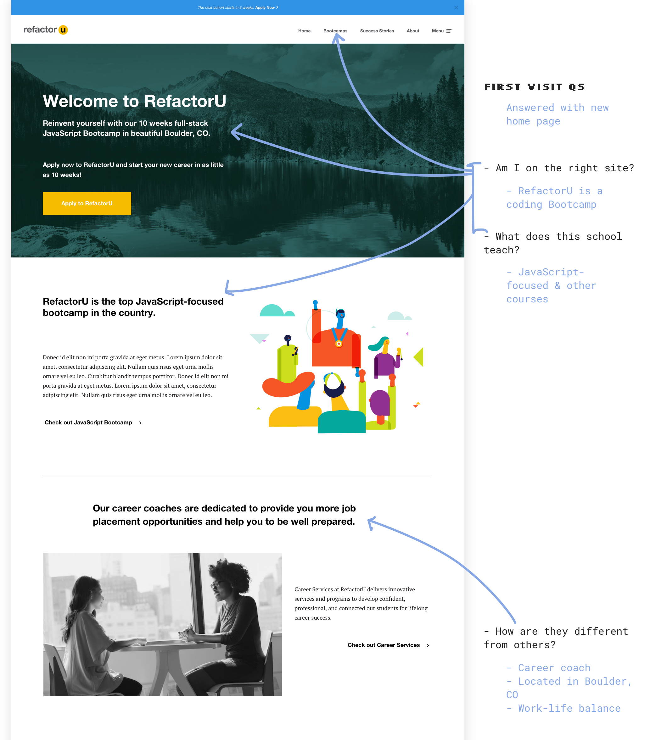
QUESTIONS PROSPECTIVE STUDENTS ASKED
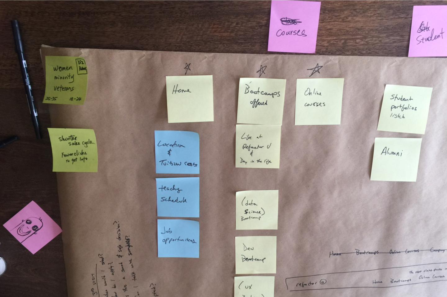
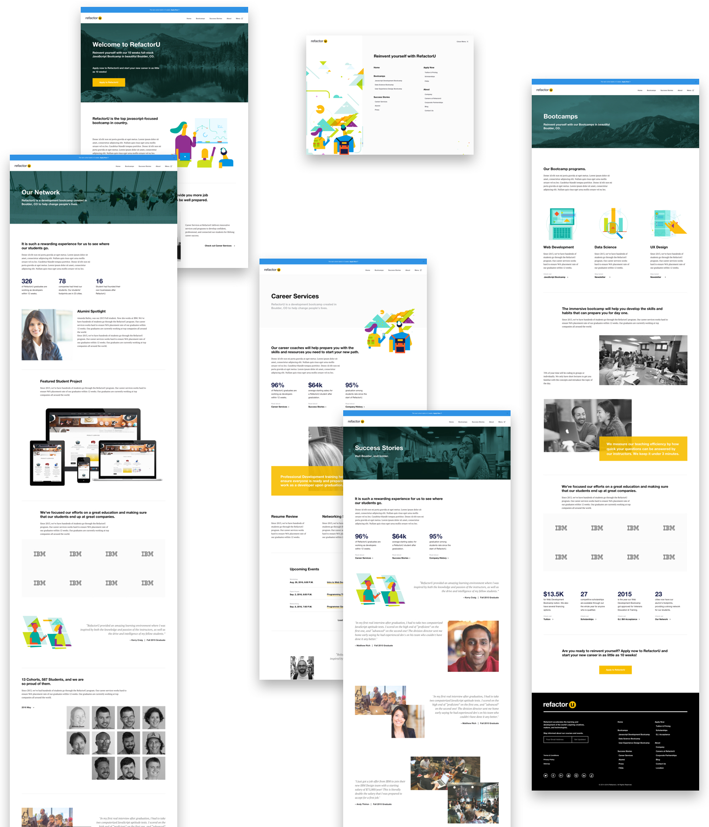
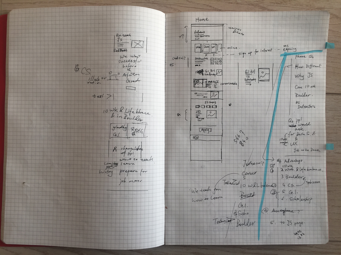
HOME PAGE information block SKETCH
HI-FI HOME PAGE DESIGN
SITE STRUCTURE
Atomic Design
We centered the design around prospective students' concerns, leading to a content/information-first design process. We then took the Atomic Design approach for our UI and visual elements for the website design.
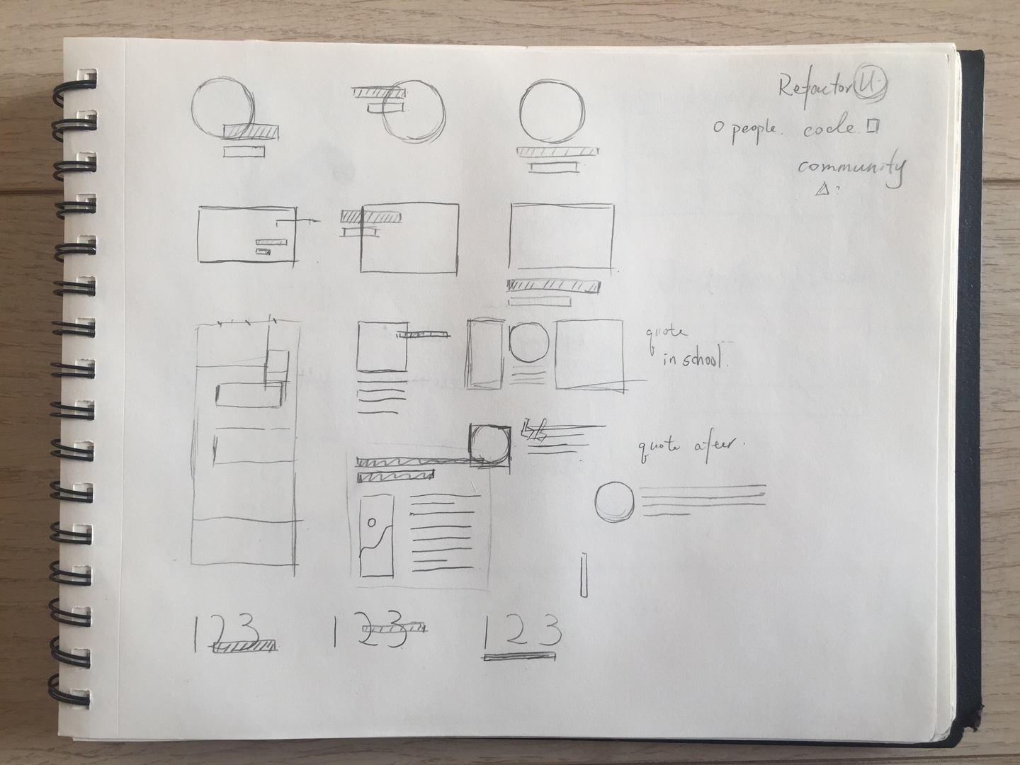
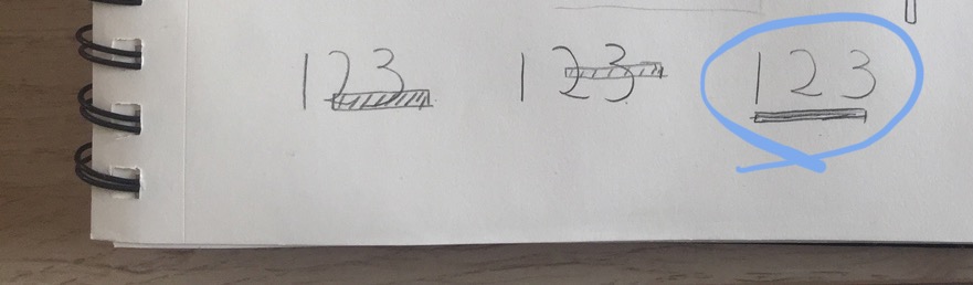
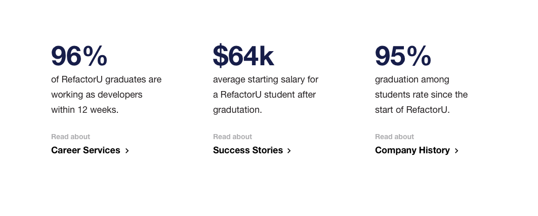
Visual Module - Numbers
SKETCH
HI-FI UI Module
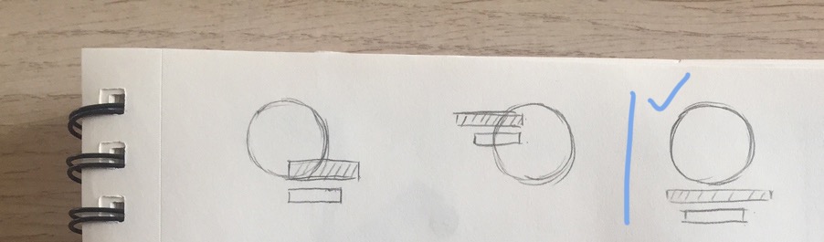
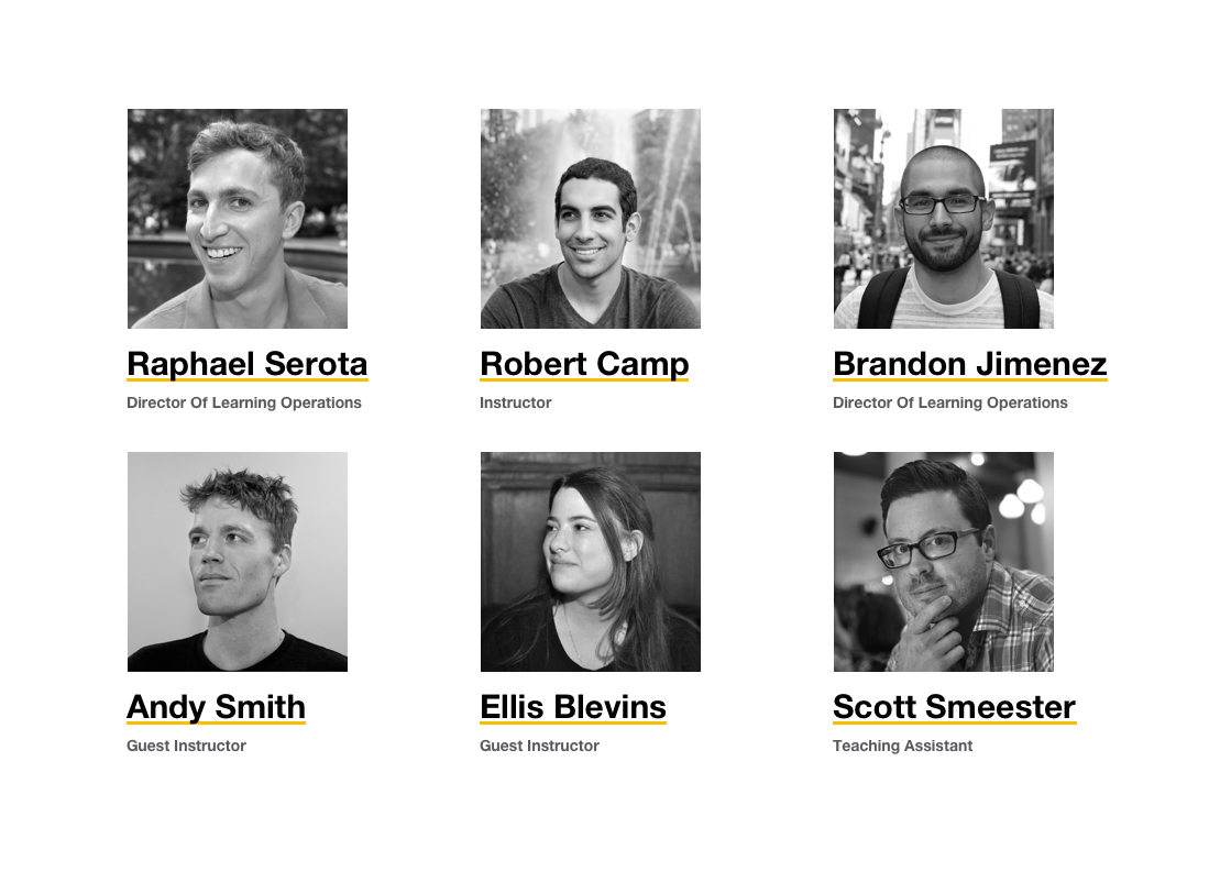
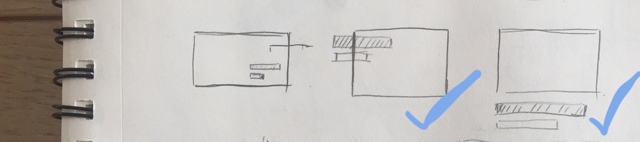
Visual Module — People
SKETCH
HI-FI UI Module
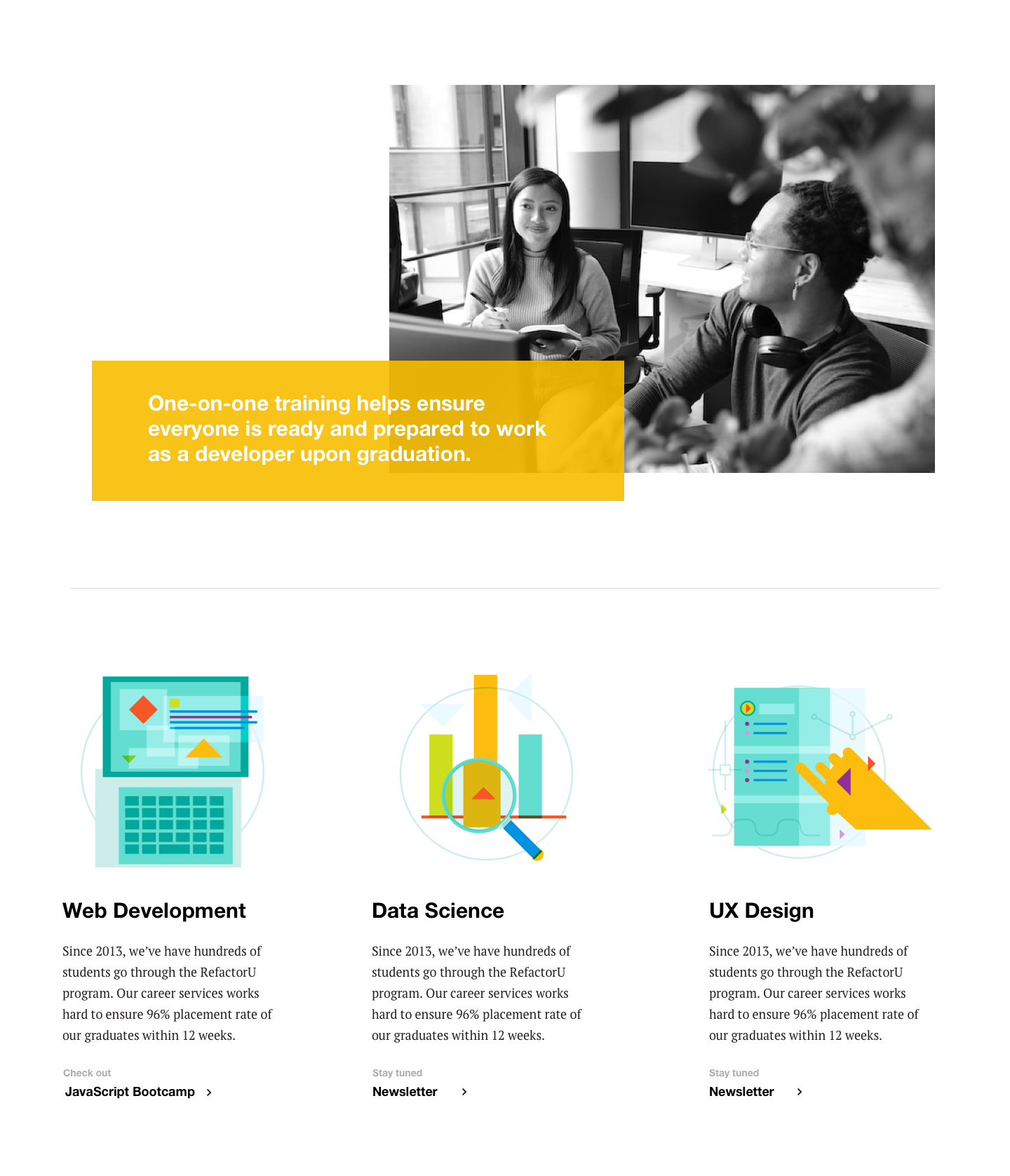
Visual Module — Services & Products
SKETCH
HI-FI UI Module