Kaopu HR
Brand identity, Landing site, & UI Design System
Kaopu HR
Brand identity, Landing site, & UI system
Background
"KaoPu" is the pinyin spelling of the Chinese word "靠谱." It comes from the northeastern Chinese dialect and describes someone who takes something seriously and exhibits commitment, persistence, a sense of responsibility, and perhaps devotion. This person in the discussion has earned a reputation for being trustworthy, reliable, and getting things done.
This term is usually used in informal situations. With the association with the northeasterners' identity, the term also encodes the sense of endearing, humorous, authentic, and unpretentiousness. The brand KaoPu HR is a talent management system that embodies the same value as the term "Kao Pu".
Scoping
When the brand came to me, it didn't have brand guidelines or brand positioning articulated for creatives. Upon auditing the product site, I understood more about where the brand was at and where it wanted to go. Then, the client and I decided on the deliverables.
- Establish a brand creative brief, brand visual identity, and brand guideline that is at a scale suitable for a start-up brand.
- Landing site that applies the visual identity.
- Establish the UI design system so the brand's in-house dev-background UX designer can easily use it to further the product design.
I conducted a discovery interview with the brand's founders. Based on the interview, I set out the creative brief to describe the brand. The brief is shortened as below.
Design Brief
Target Audience: Mid to small-sized companies with limited HR resources. People who seek upward mobility in their professional lives.
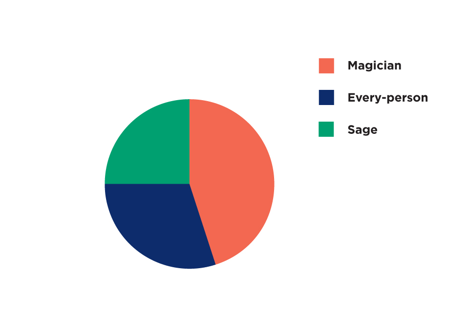
Brand Archetypes: Based on brand exploration, we defined the brand archetypes as the magician, every-person, and sage.
The Magician archetype is why KaoPu HR is qualified to say "We can transform your company’s hiring process and find the right candidate, and we can help the employees to become “靠谱” for their next role in the company.
The every-person archetype is why KaoPu HR is the embodiment of “ 靠谱”.
The sage archetype is why KaoPu HR is qualified to be trusted with the knowledge and services it provides.
Brand Personality: KaoPu HR is supportive, reliable, knowledgeable, trustworthy, and charismatic; it has a playful mind to make working better, easier, and more pleasant.
Tonality: Energetic, technical intellectual, and innovative
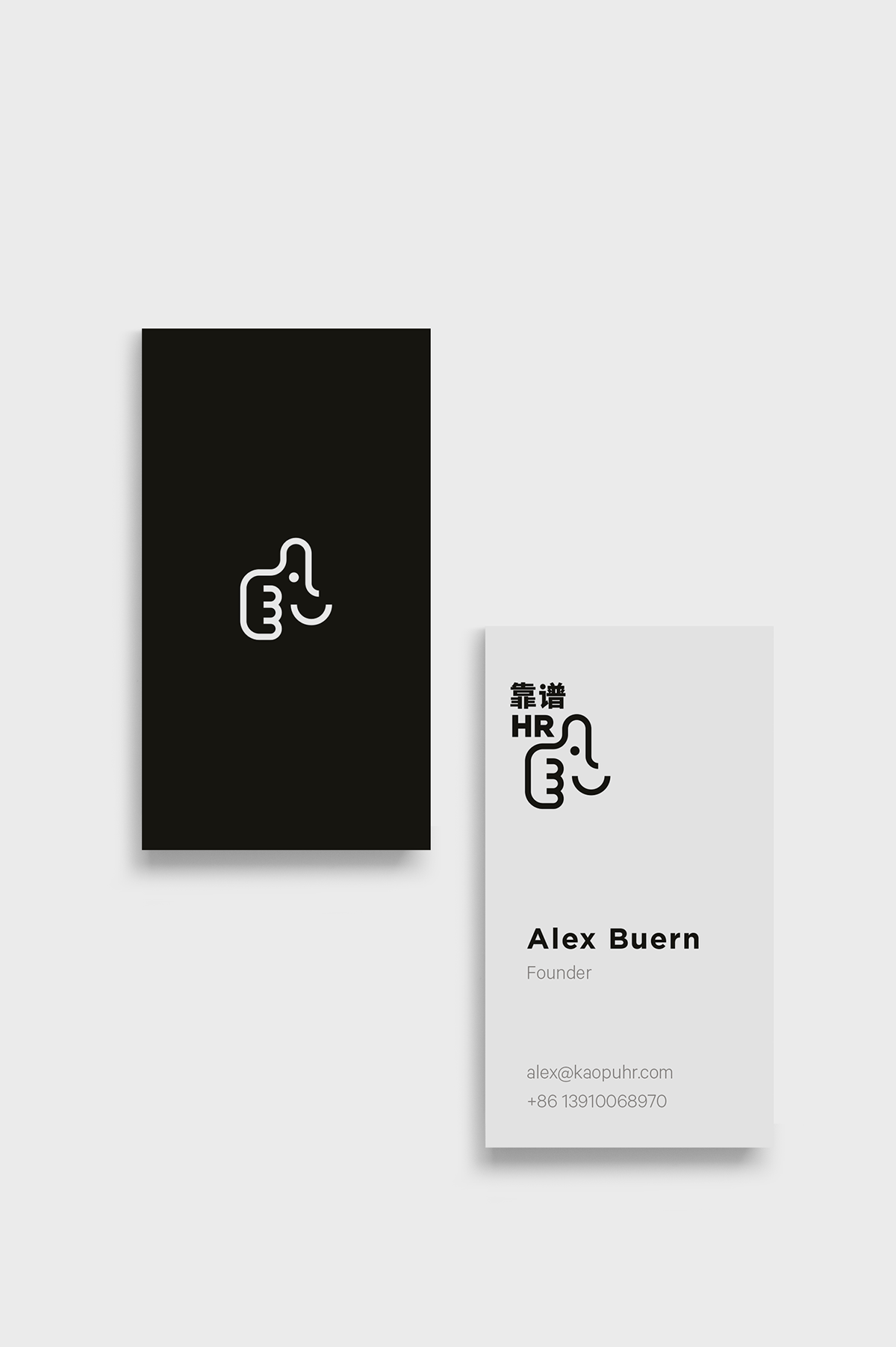
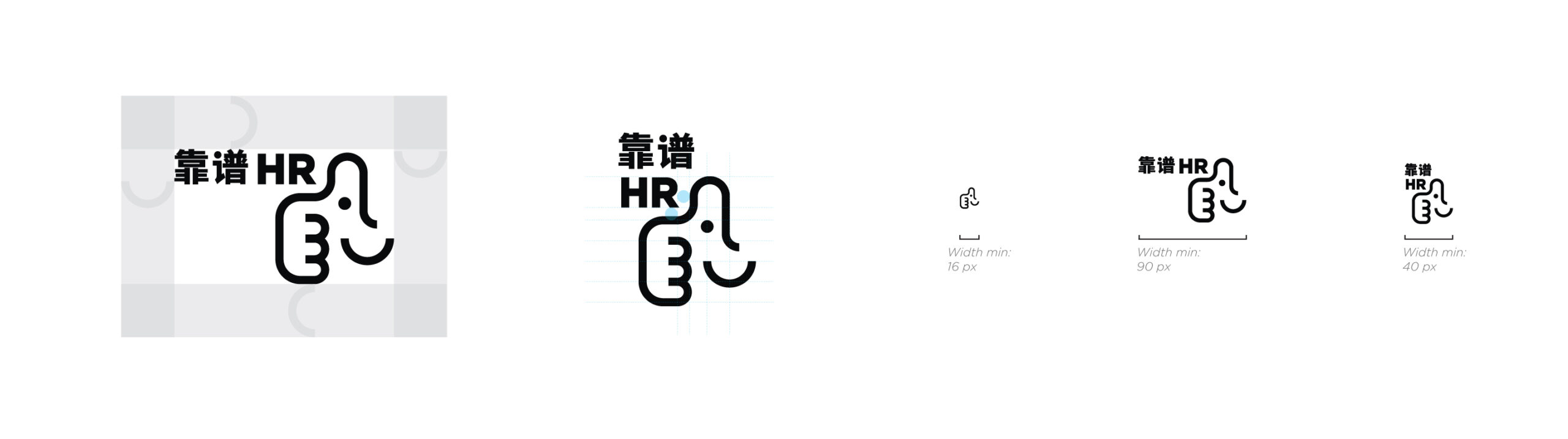
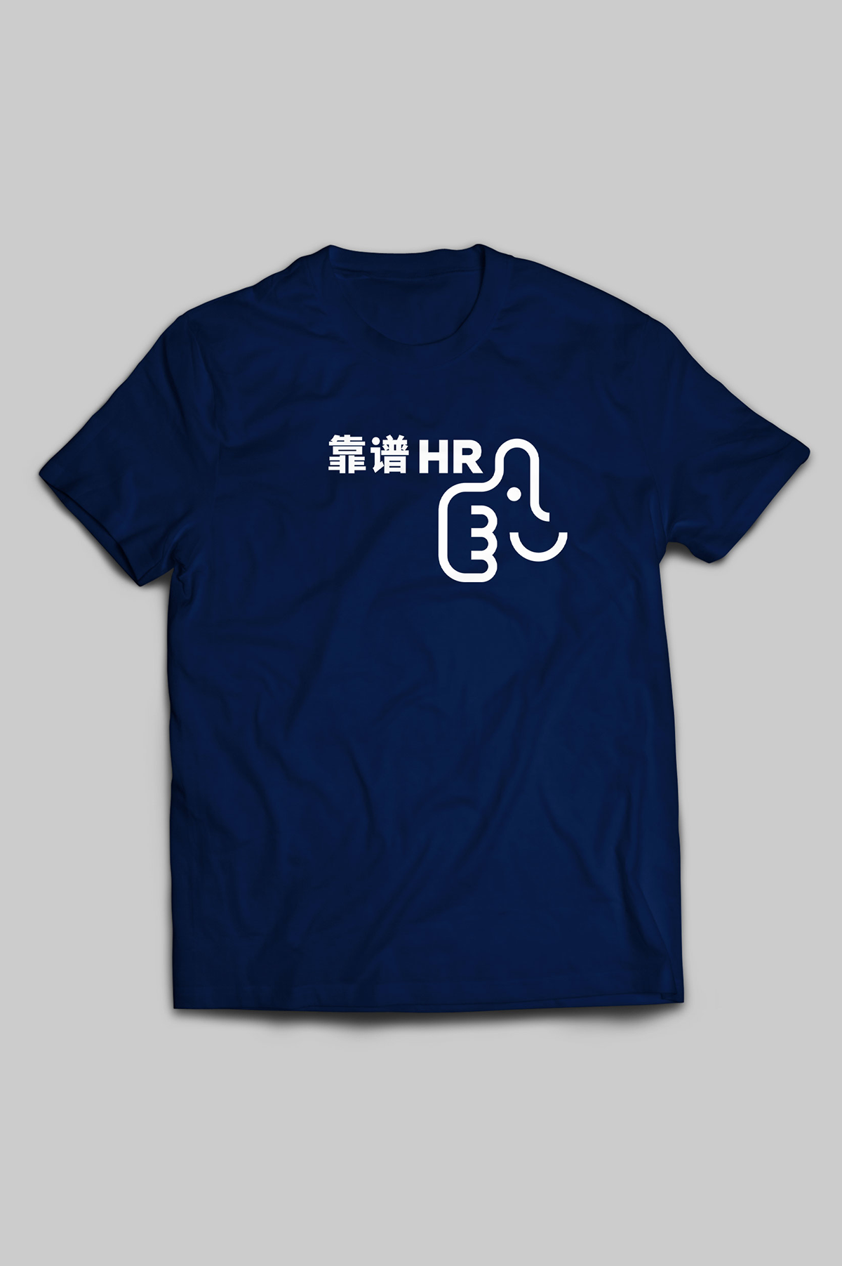
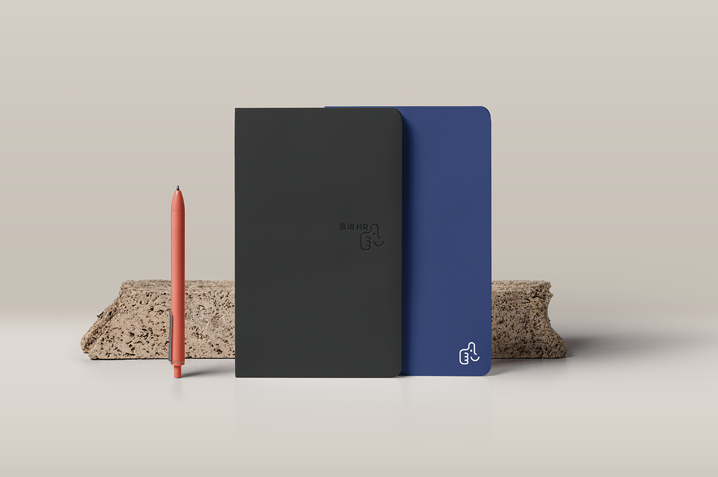
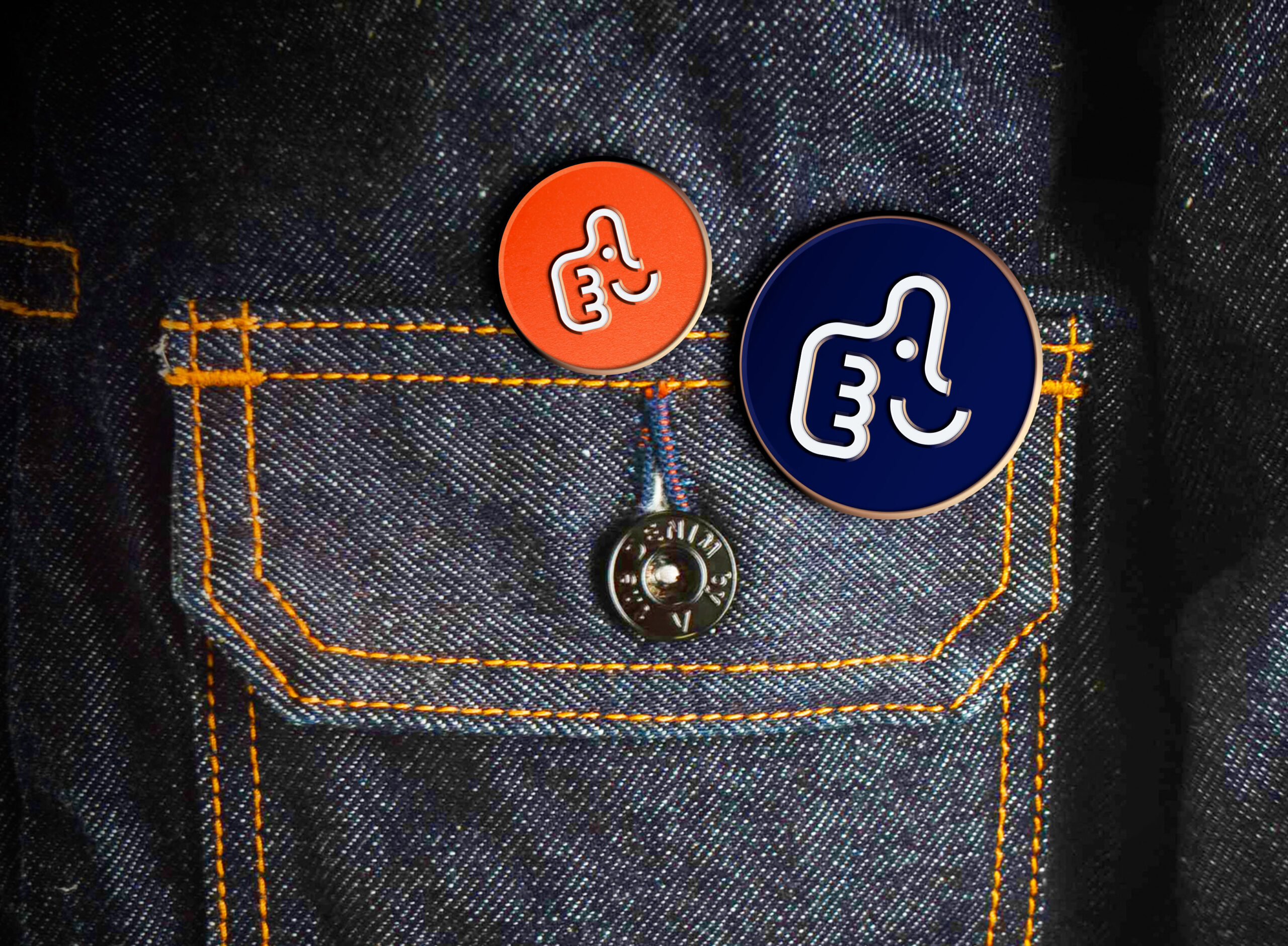
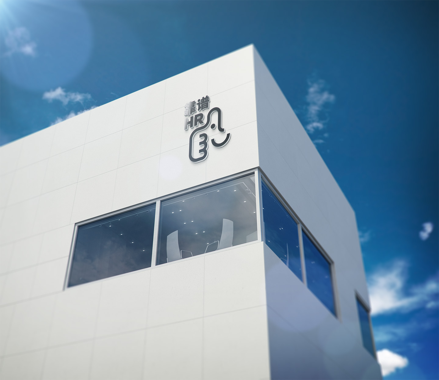
Deliverables - 1 - Brand Identity System - LOGO
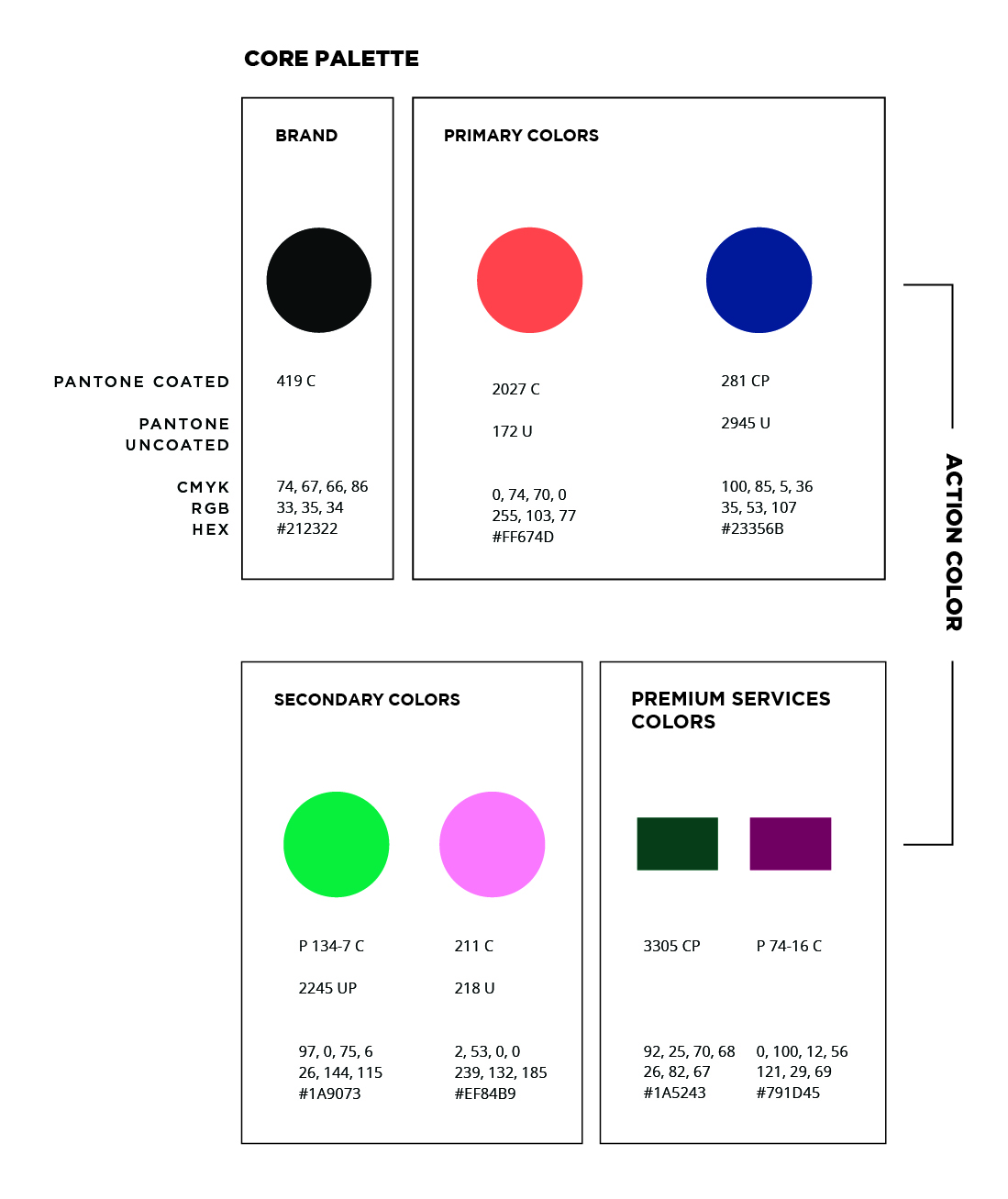
Deliverables - 1 - Brand Identity System - Color Palette, A Cinematic Approach
Color is highly associated with human emotions, which make strong memories. To establish a relationship with the targeted audience, a brand can leverage its color story to start establishing an emotional bond.
Setting certain moods with colors has been a strategy in cinematography. I developed the color palette for KaoPu HR by creating its color story.
The product color story reflects the brand's values and emphasizes the brand image.
For example, the rose-orange color will be used lightly in the product when the function, status, etc. relate to the sense of “up” and want people to associate with happiness and fulfillment.
And, the evening blue will be used in the product when the function, status, etc. relate to the sense of a “stable” or “routine process” and want people to associate with reliability and trust.
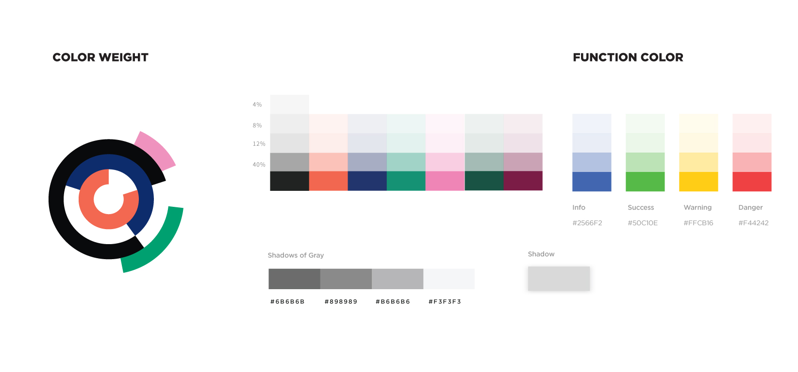
The detailed usage that explains "action color" and "color weight" is included in the brand style guideline.
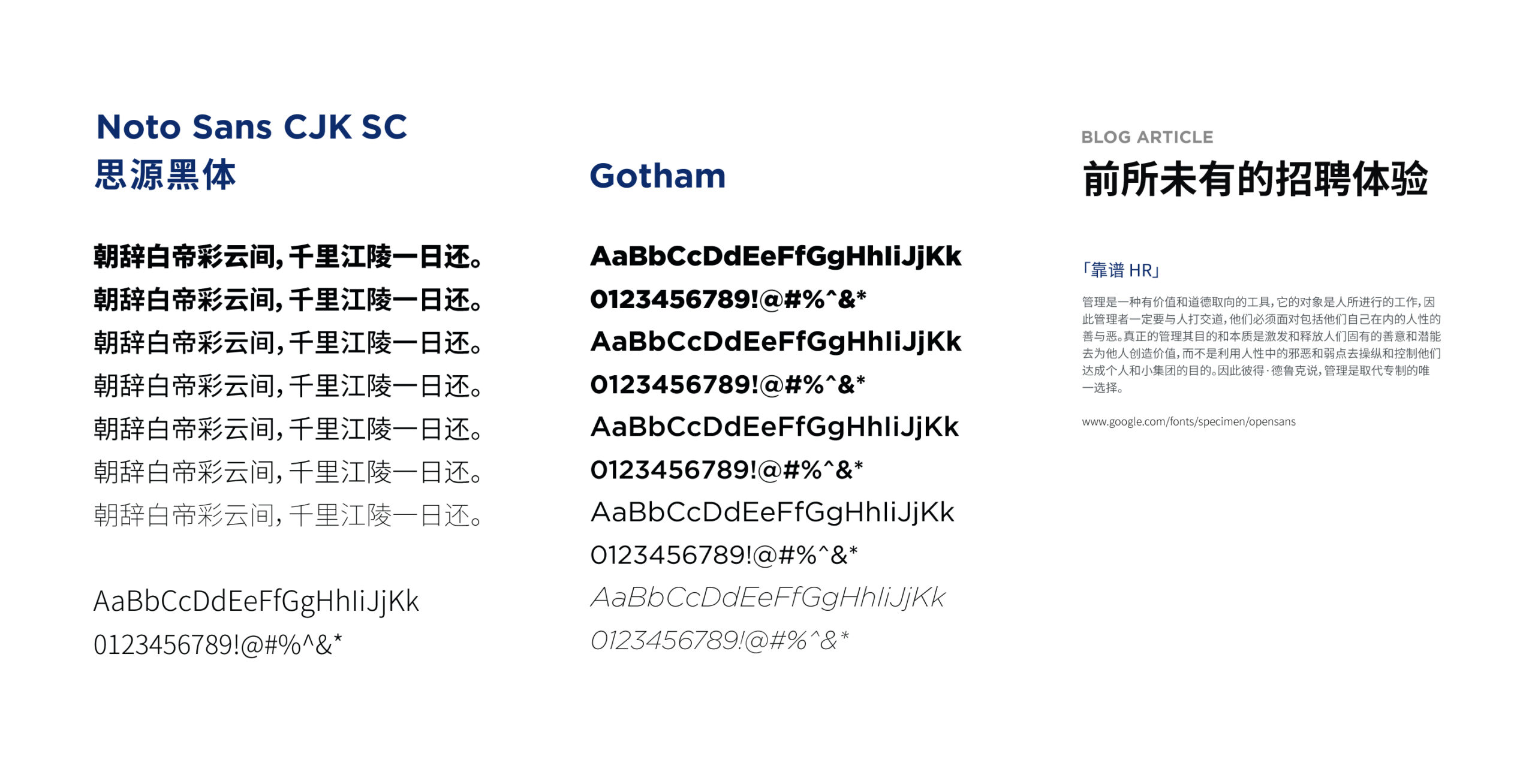
Deliverables - 1 - Brand Identity System - Typography
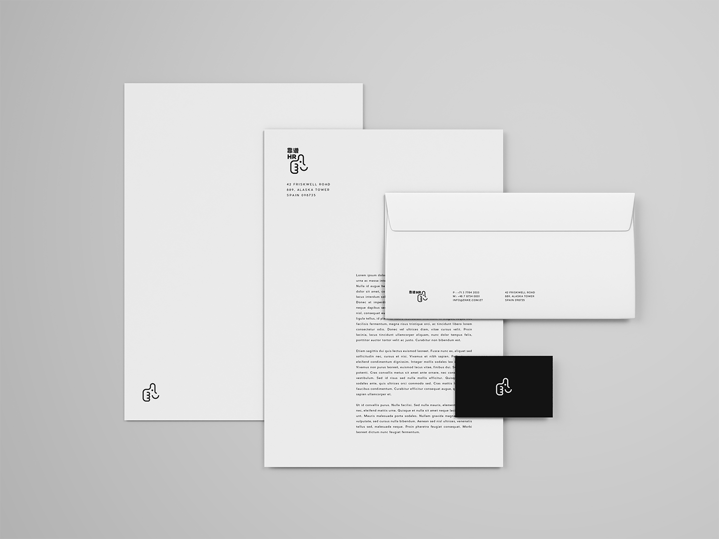
Deliverables - 1 - Brand Identity System - Applications
Deliverables - 2 - Landing Site
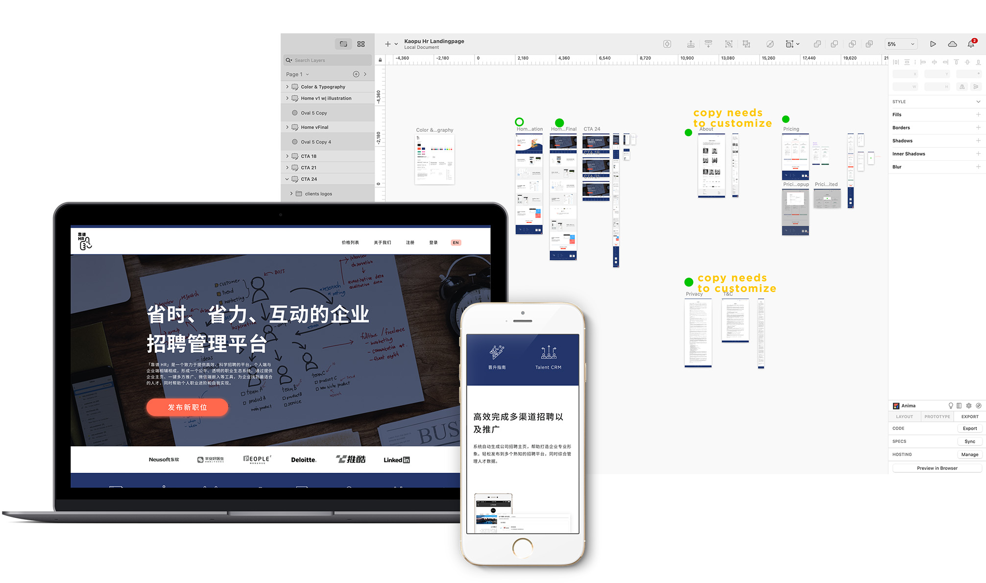
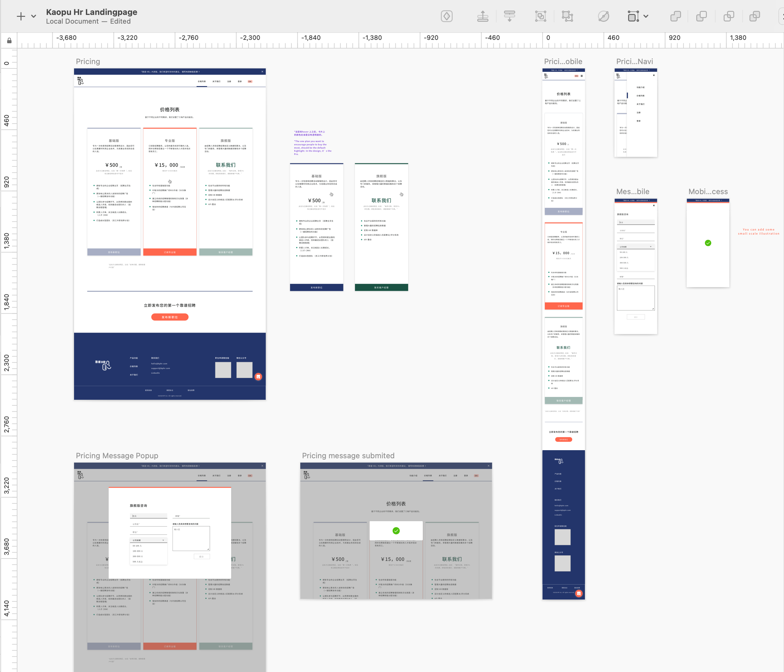
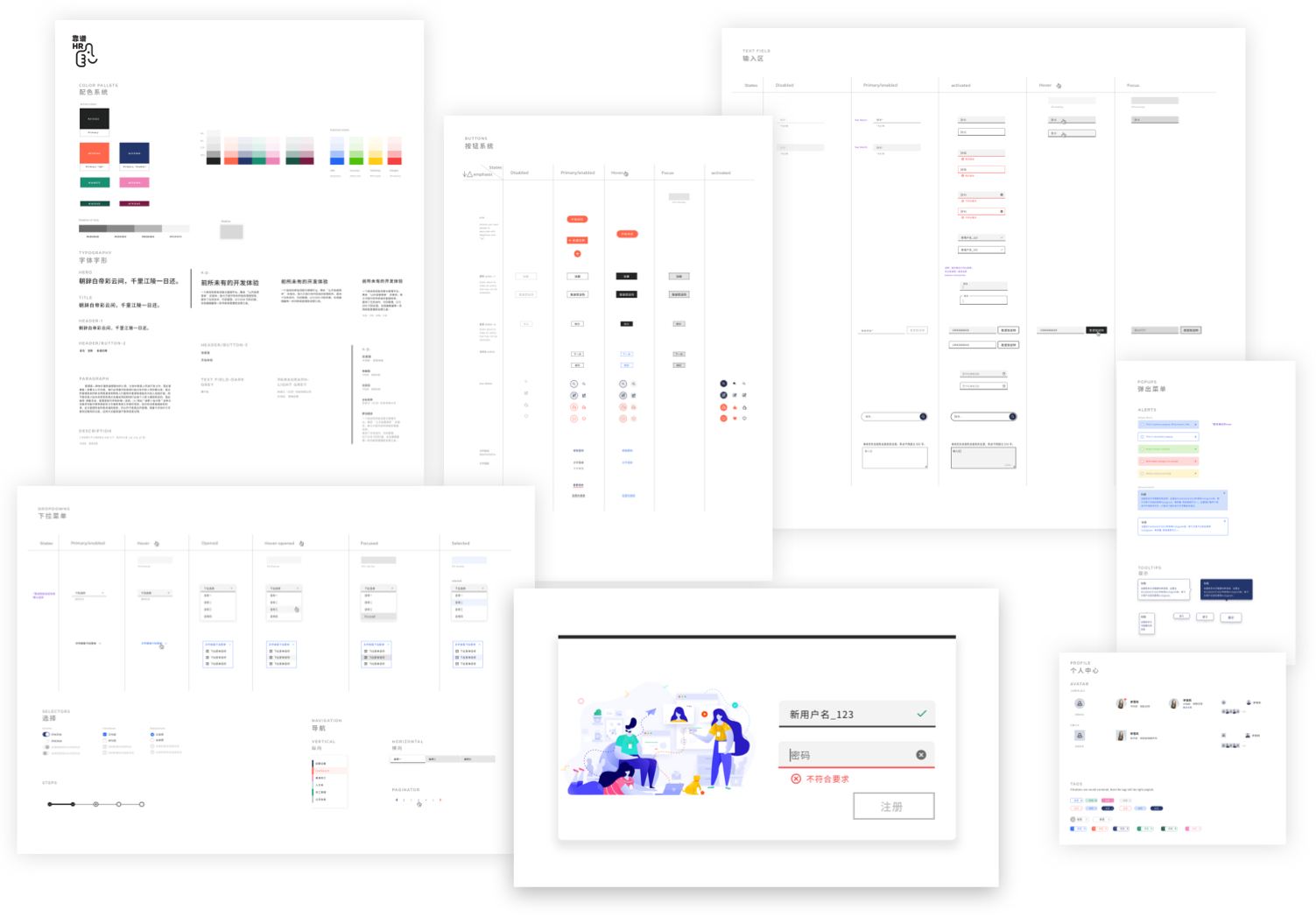
Deliverables - 3 - UI System
The UI Toolkit includes the color system, typography system, hierarchical button system, text fields, menus, tags, and notifications.